Selling my share of real estate over the years I have seen all types of renovations. From a $100,000 lime green kitchen to a freshly carpeted bathroom floor. Many projects have left me scratching my head. When it comes to a remodel, everyone has their own personal style but one theme that I’ve noticed over the years in the most striking renovations is a balanced blend of reclaimed original features in juxtaposition with intelligent, modern upgrades. There is something very sexy and satisfying about a renovation that has been tastefully infused with original details.
My favorite style of renovation has always been mid-century modern. The clean lines, walls of glass, and natural flow of interior to exterior spaces tugs on my heart strings. It started as a hobby and morphed into an obsession. Renovating a mid-century home is like putting a puzzle together. How can you preserve the original features while updating the space so that it feels current and fresh?
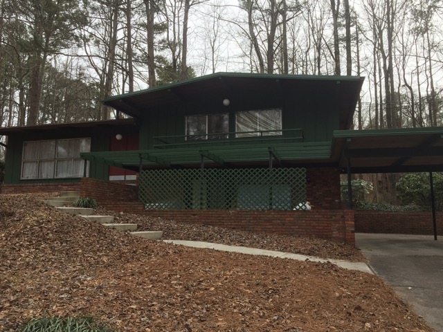
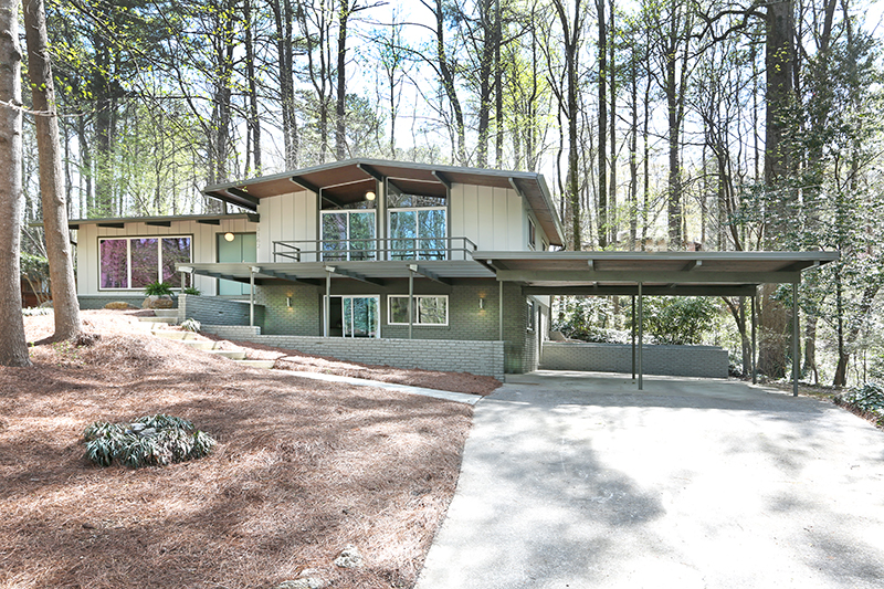
The most recent renovation project I had the opportunity to work on was a home built in 1972 located in the mid-century modern neighborhood of Northcrest. The original owners had taken pride during their ownership and many of the home’s original features were impeccably maintained. We called it the “Lynnray House” and it boasted a dramatic elevation with a low pitch roof, multi-level floor plan and plenty of of glass that let the natural surroundings in.
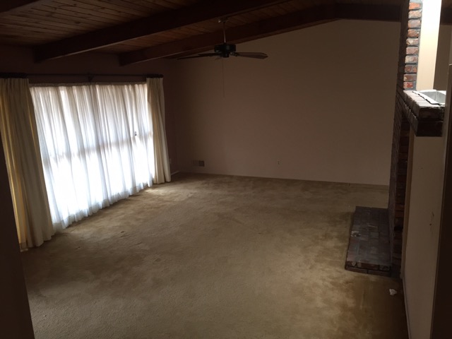
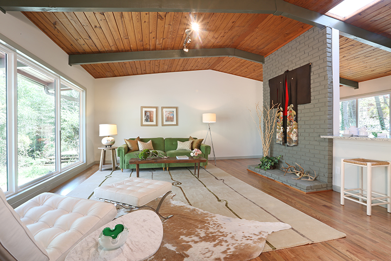
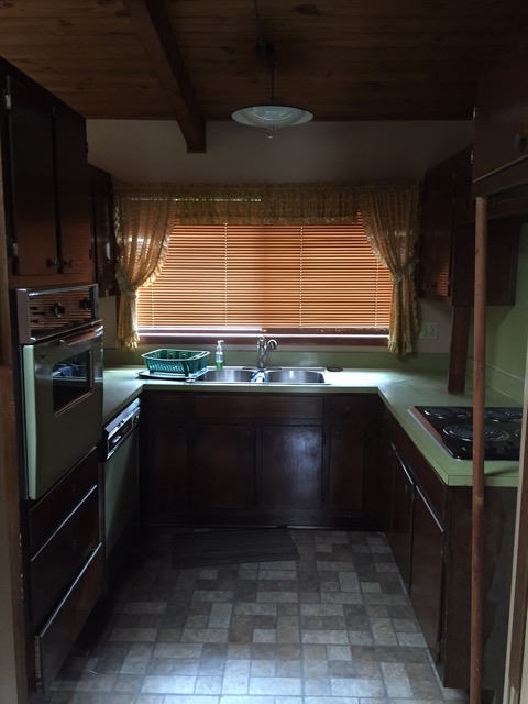
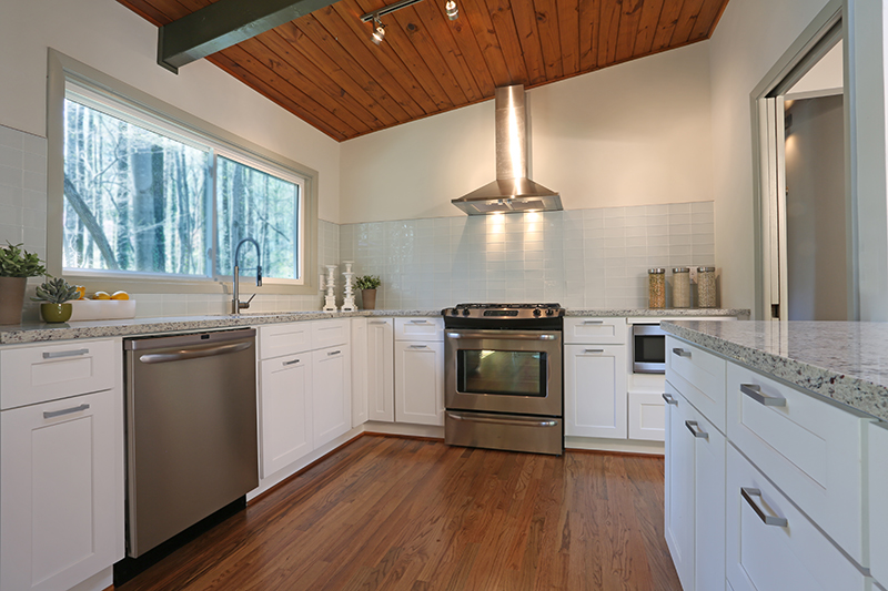
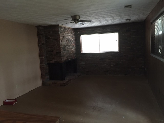
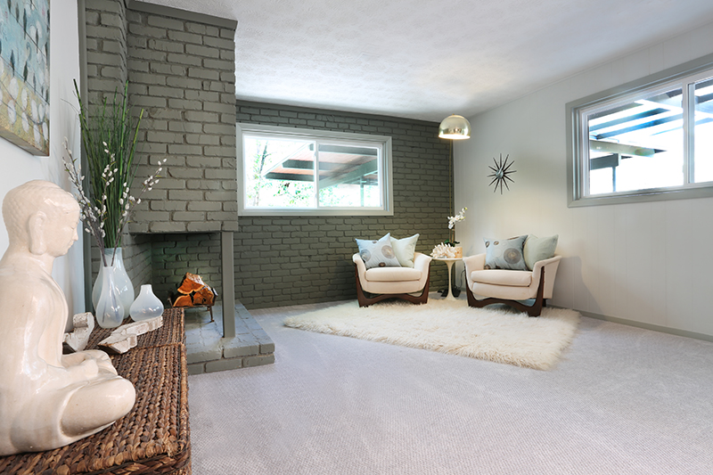
The actual floor plan needed little modification. Just one wall was brought down to open the kitchen up to the main living space. The windows were replaced and expanded to enhance the love affair with the natural light and the interchangeable indoor outdoor living. Surprisingly, the only original wood floors were in the bedrooms the rest of the home had a lovely mud colored carpet, which looked like it could have been original as well! We added wood floors throughout the home and blended them perfectly with the existing wood in the bedrooms.
For me, inspiration often comes from my surroundings. In this case I drew upon the warmth of the original tongue and groove ceilings and offset the warm wood tones with a cool, modern, paint pallet. The new kitchen was opened up and streamlined and I intentionally chose to not use upper cabinets and instead opted for a larger bank of built-ins around the refrigerator. This kept the eye focused on the dynamic pitch of the tongue and groove ceiling – the staring character of this home.
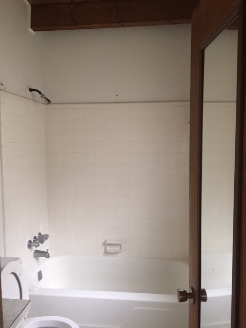
In the bathrooms the old shower tile was replaced with large, white, rectangular tile that traveled vertically up the wall and visually added even more height to the space, again, playing up the T&G wood ceilings. The original tile was left on the floor and simply acid washed and re-grouted. This gave the bathrooms a bit of history and depth. All the fixtures, vanities and toilets were replaced. The finished product was a striking mix of contemporary and years gone by. A labor of love that told a story in the details, ornamented with special touches and infused with natural light.


