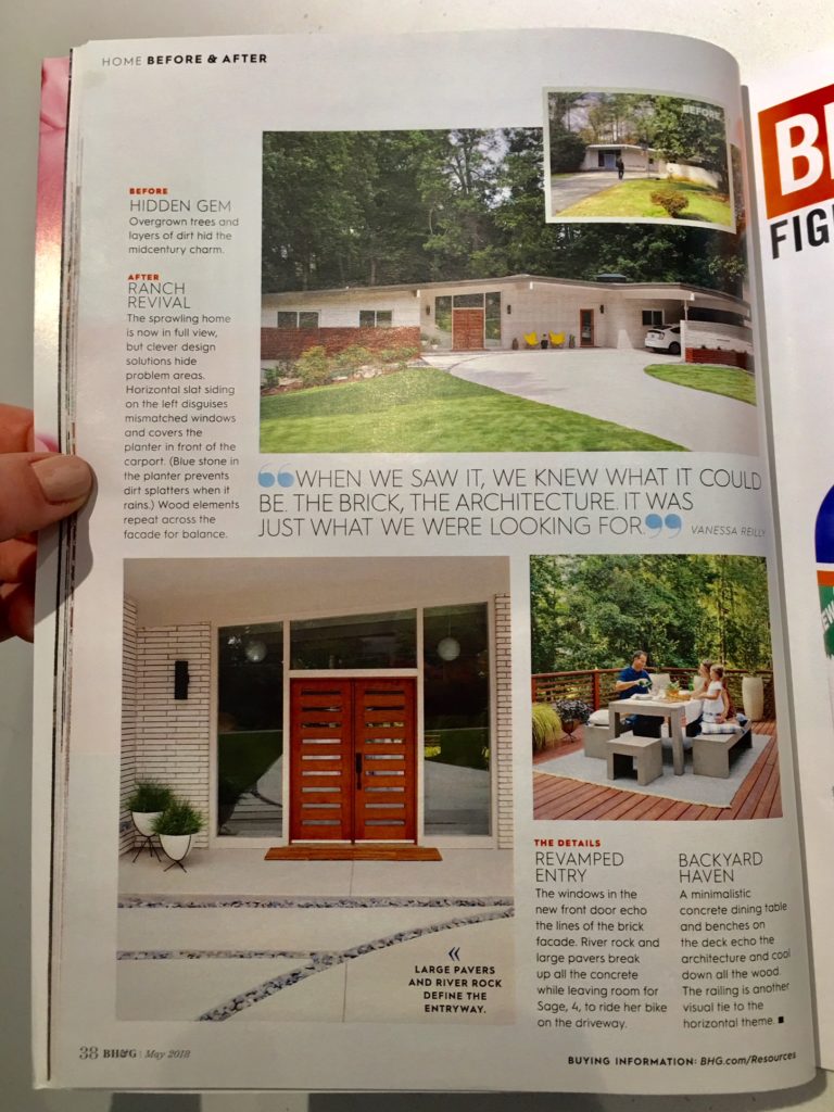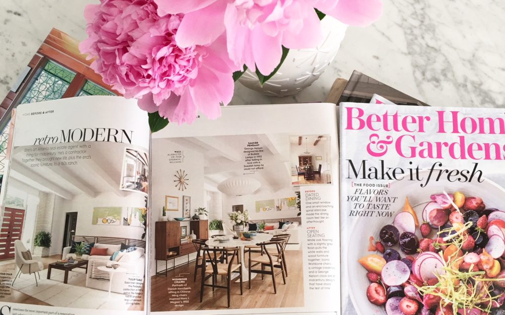
As an Atlanta real estate agent, Vanessa Reilly certainly loves the midcentury modern property. Billy Joe is the contractor that helps her infuse new life into the properties they work on.
Recently, Better Homes and Gardens Magazine featured both Billy Joe and Vanessa Reilly in their May Issue. The piece looked into a property they worked on together describing it as “dark and confusing” before the work was done and “bright and modern” once complete.
A True Love for Midcentury Design
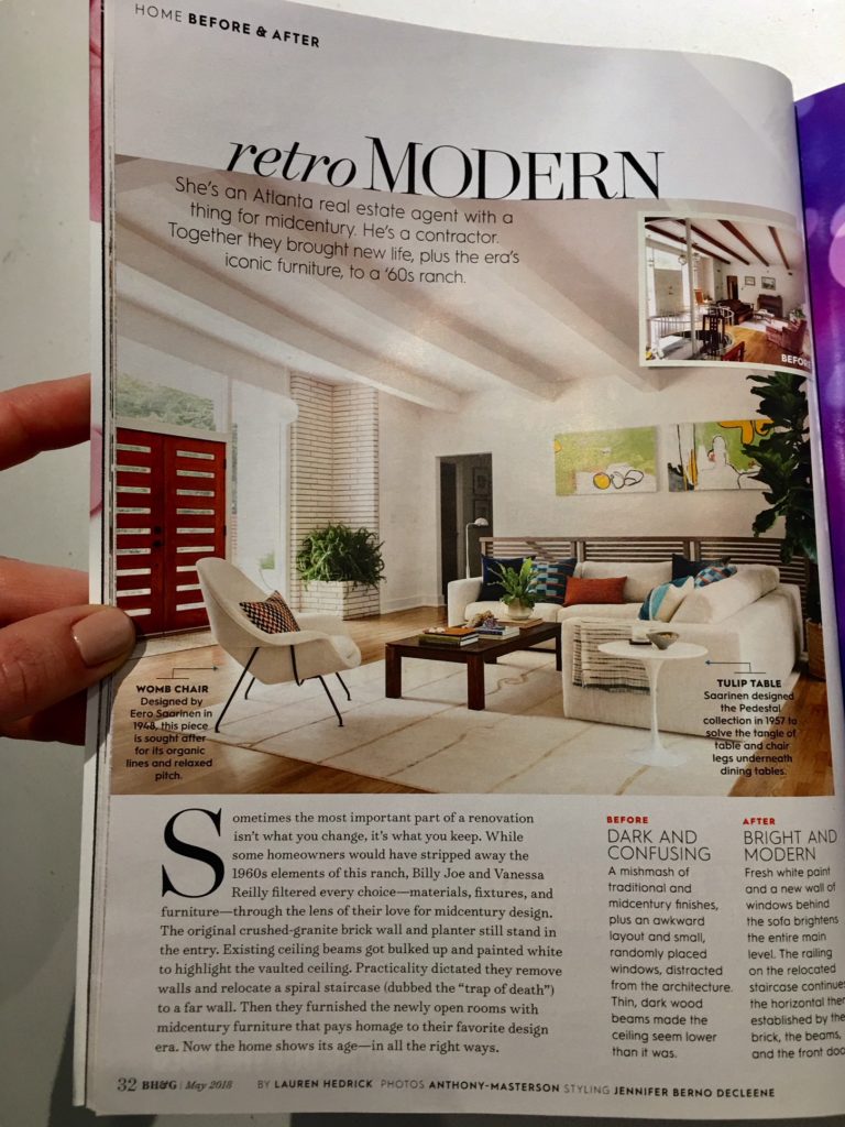
Often, homeowners renovate older properties to bring them into the modern era. They are looking for convenience, modern features, a design to impress friends and all the elements of a new home. This could, however, take away some of the beloved design features the older property once had.
Vanessa and Billy Joe don’t strip the property of the elements from the past. Instead, they take the time to consider the fixtures, materials and furniture they will use to incorporate the old and bring it into the new.
In the article from Better Homes and Gardens, they looked at a 1960s ranch home renovated by Billy Joe and Vanessa. This property still included the ceiling beams, a spiral staircase and many other original features. The beams were painted white to brighten up the room and the spiral staircase was moved, but these elements still remain.
In addition, they added midcentury furniture to the rooms they opened up to help bring out the design. While the property continues to show its age, it now does it with a modern twist.
From Dated Dining to Open Seating
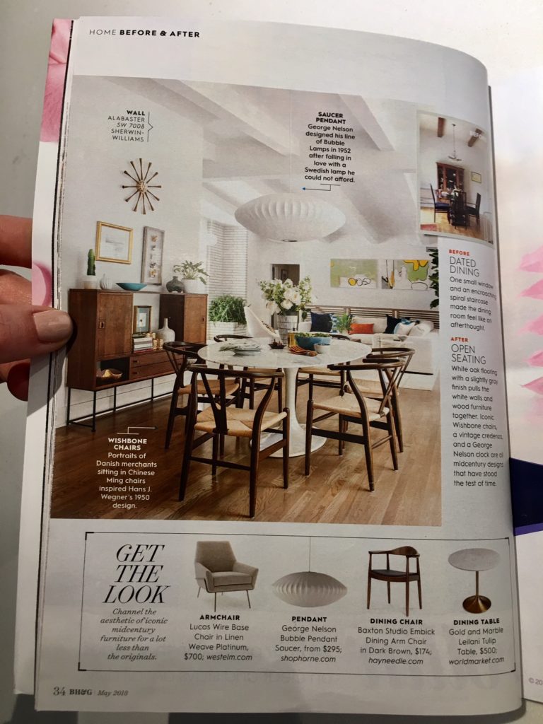
The article talks about how the property was transformed from a dining space with just one small window and a spiral staircase taking up too much of the room to an open seating concept. The oak floors, with the white walls make it an open feeling space and moving the spiral staircase helped to open up the areas.
Kitchen Upgrades
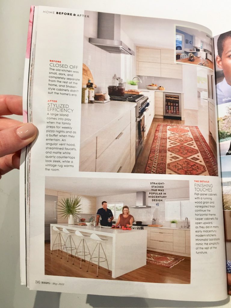
We all know the kitchen is the heart of many homes and buyers go “ga-ga” over the right kitchen. With this 1960s ranch, the kitchen went from “old, small, dark and completely separated” to “stylized efficiency,” according to the article.
It was like a separate room before the property was redone with Shaker-style cabinets. After the renovation, it has a large island; the kitchen has been opened up to be included in the rest of the house and includes an angular vent hood, quartz countertops and plenty more modern features.
The article found in the May Issue of Better Homes and Gardens Magazine goes on to talk about some of the other improvements made to the property. It still looks like it came right out of the 1960s, but now it has that perfect touch to earn the midcentury modern name.
This ranch style home includes red brick architecture on the outside, along with a very natural setting around the home. It would have been a common design back in the 1960s and today, it has become a hidden gem perfect for the next owner.
